How to introduce colour using paint and where to start when your home is a blank canvas
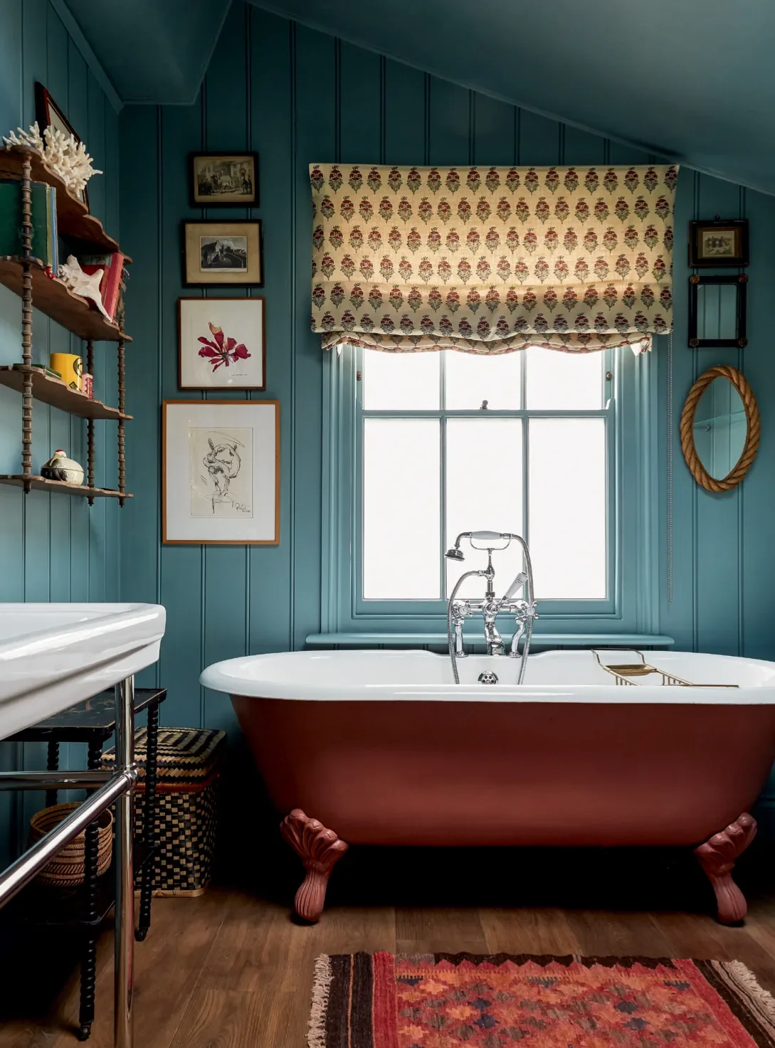
Interior Desiger Lonika Chande's selected Dulux Gravel Eggshell for the tongue and groove panelling in the bathroom of her West London house, which contrasts beautifully with the red tone of the bath. Source: House and Garden Uk. Photographer: Paul Massey.
Paint colour can completely transform your home and how you feel living in the space. I’ve seen it time and again: a simple coat of paint can shift a mood, change the energy of a room, and bring a home to life.
I’ve worked with countless clients who love colour but feel nervous about painting with anything other than white. It’s my job to help them confidently find colours they will love living with. It’s understandable, as the go-to colour for Australian homes is white. So, the question is, how to choose paint colours that we know will work while embracing colour?
Where to Start With Paint Colours
If you’re wondering how to begin, here’s my go-to approach:
Think about how you want to feel
Do you want your living room to feel cosy and cocooning or bright and energising? Colour influences the atmosphere significantly.
Consider the architecture
The home’s style and proportions guide how bold or subtle you can go. A traditional Queenslander will take colour differently from a modern architectural home.
Light changes how colour works
Orientation and light throughout the day can alter how colours appear.
Consider the paint colour flow from room to room
Your overall colour scheme should connect with your furniture and furnishings. Not every room needs to match, but the palette should flow, creating chapters of the same story, each with its own tone but part of a cohesive whole.
Start with your textiles
Textiles are a great source of inspiration. Cushions, curtain fabrics, or rugs already contain colour combinations that work harmoniously.
Look at your artwork
Art reflects personal taste and your emotional connection to colour. I often use a client’s artwork as a starting point, pulling tones to guide the palette. I can also source art as part of the overall scheme that will also help to influence the colour palette.
How Natural Light Affects Paint Colours
It is important to consider the orientation of the room and how the paint colours look at different times of the day.
North-facing rooms (Southern Hemisphere): Soft, consistent light; cooler undertones may look muted.
South-facing rooms: Less sunlight; can feel cooler. Warm tones like work well.
East-facing rooms: Morning sun is bright and warm; afternoons can feel cooler. Colours may shift from vibrant to muted.
West-facing rooms: Warm, golden light in the afternoon and evening can make colours feel richer or more intense.
How to Test Paint Colours with Sample Boards
Instead of painting the walls, paint sample cards or boards with your chosen colours and hold them in different areas of the room. Check them at different times of day to see how natural and artificial light affects the tone. This ensures your colours work with fabrics, rugs, and artwork before committing. Porters Paints provide A4 hand painted sheets as part of their service.
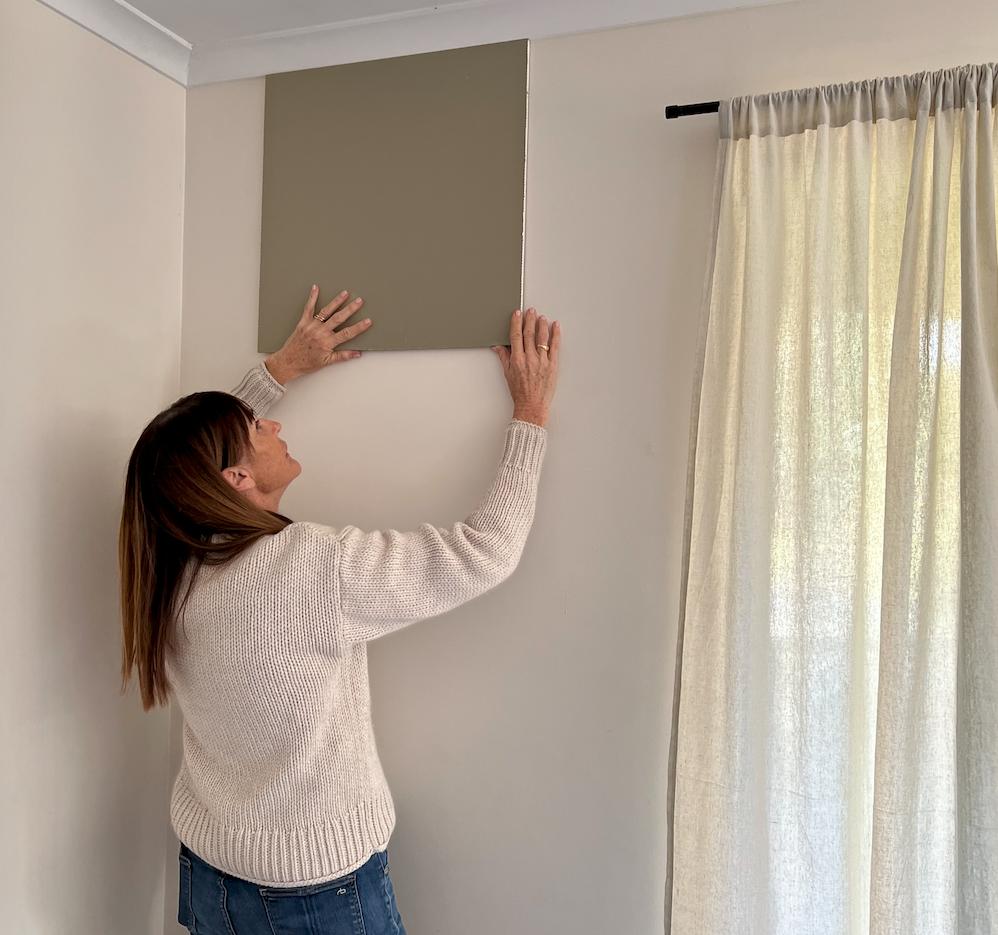
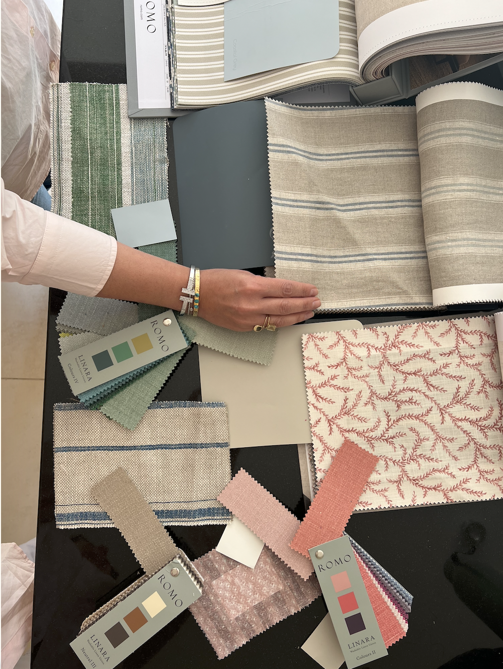
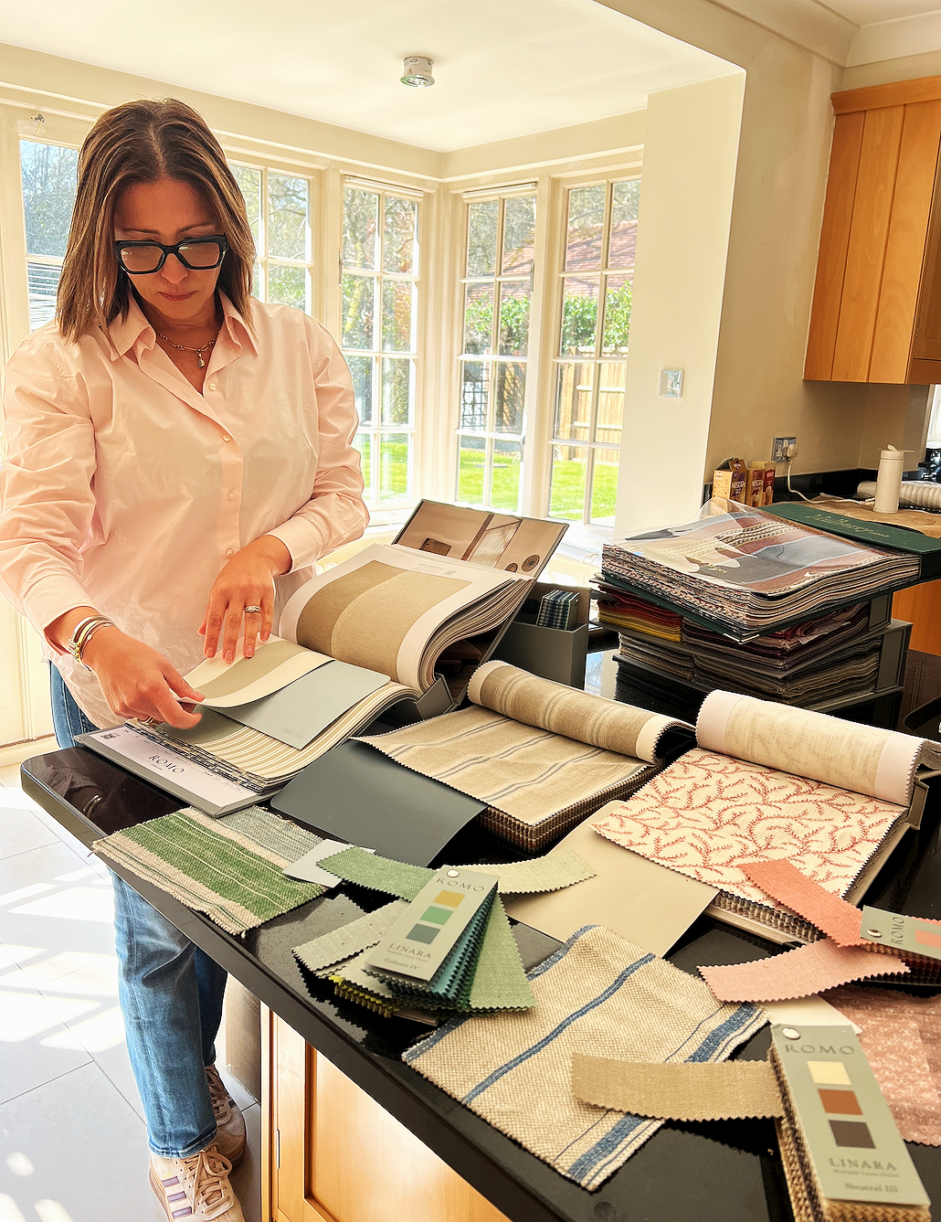
Use sample boards to test colours
My client Kristen testing paint colours for our Straddie Beach House project
What if I Get Sick of the Colours? And What About Resale?
Many people stick to white walls because they worry about getting tired of colour or resale value. When deciding on paint colours you need to consider:
How long will you be in the home?
If it’s 5-10 years or more, focus on creating a home that makes you happy. Resale shouldn’t dictate your choices.
Use a designer for guidance
As a designer, I can ensure colours are balanced, cohesive, and timeless - still attractive to future buyers. I also select colours as part of the overall scheme and not on their own.
Choose colours with care
When colours are selected with your lifestyle, lighting, fabrics, and artwork in mind, you’re less likely to tire of them.
Don’t stick to trends
Choose colours that work with your interiors and personal style. Trendy shades can date quickly.
Opt for subtle, fresh, or moody tones
Avoid bright, overpowering colours. Soft, nuanced, or deep tones create impact without overwhelming the space.
Consider versatility
Pair richer colours with neutral trims, furnishings, or accessories for flexibility over time.
Think about mood and functionality
Colour can enhance how a room feels. Calming in a bedroom, energising in a kitchen, or cosy in a living space.
A Client Story: How to Choose Paint Colours for a Blank Canvas Home
I recently worked with a client in the U.K. who was moving back into her home after 17 years away. The house had been rented and needed a makeover and my client had planned to repaint everything white before they moved back in.
When she asked my advice, I said:
“If you’re investing in repainting, why not use colour? It won’t cost any more to paint, but it can completely change the feeling of your home”
She took my advice and together, we built a palette that flowed beautifully through the house. Soft blues, a feature room in navy blue, gentle neutrals, and crisp whites that felt refreshed, calm, and timeless.
Some of my favourite paints used in this project:
Kitchen and Entry Areas: Dulux Knotted Twine - a warm, grounded neutral that pairs beautifully with natural timber and stone. Neutral paint colours are also important. It doesn’t have to be colourful throughout.
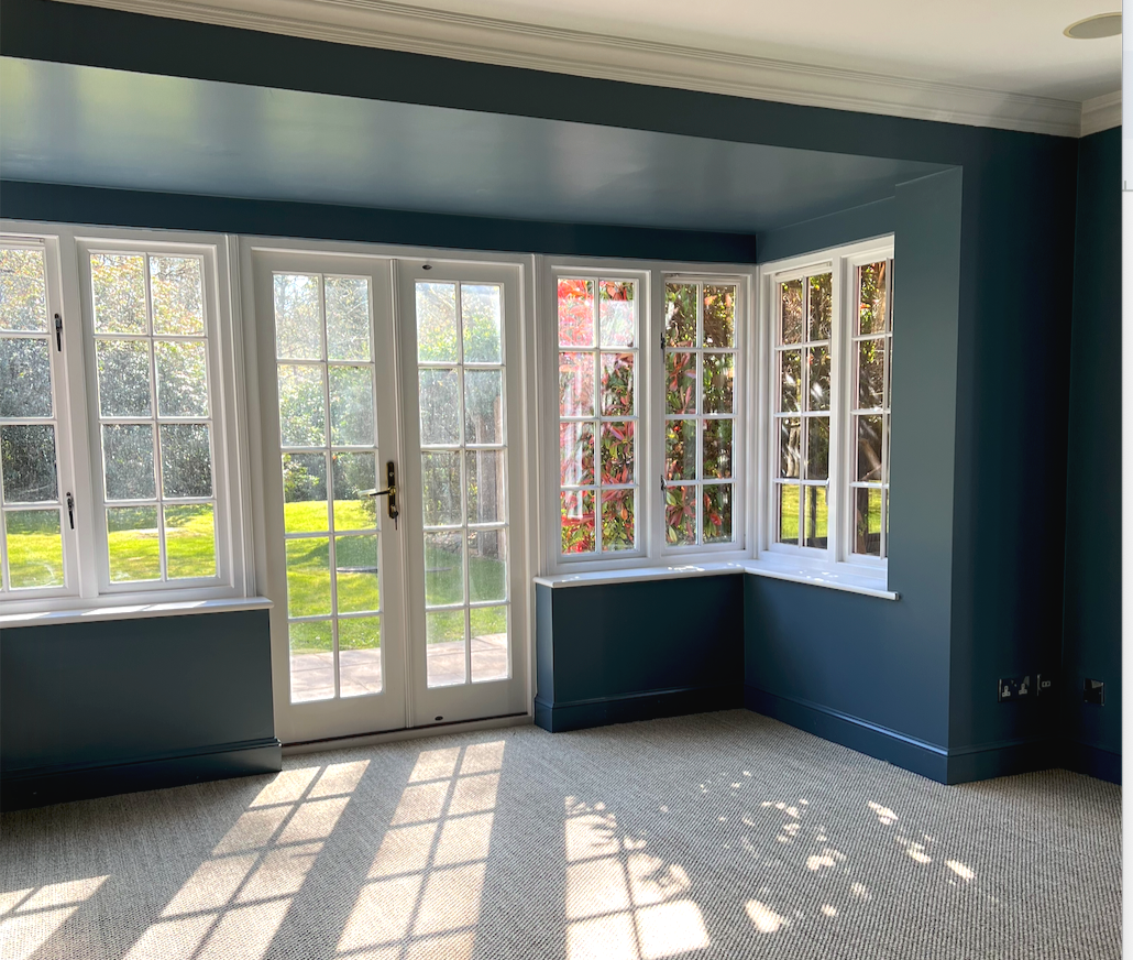
Living Room: Dulux Faded Indigo - a sophisticated, denim-toned blue that adds depth and comfort.
Each room connected effortlessly to the next because we chose the paint colours in conjunction with fabrics and finishes, creating a cohesive story throughout the home.
By carefully layering colour alongside new floor coverings, lighting, and window furnishings, we transformed the home from a dated rental into a warm, inviting, and personal space in the English countryside.
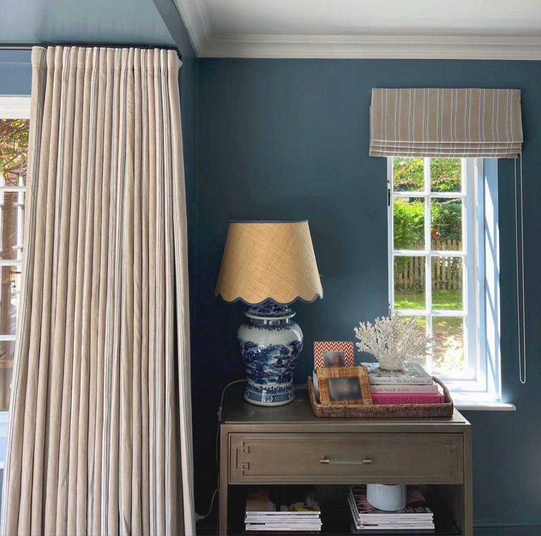
Dulux Faded Indigo on the walls of the sitting room of our Chatters Project, in the U.K. combined with custom curtains and natural sisal flooring transformed this space into a cosy heartwarming room for winter. And on site at the Chatters with my client Bruna and the materials board we created showing the overall concept for the home .
Client Story 2: Adding Colour to a White Home
While homes can feel clean, open, and timeless, without contrast, they can sometimes feel a little flat or cold.
One of my Brisbane clients had a modern, architect-designed home painted entirely white. She loved the minimal design but wanted more warmth and personality.
We introduced soft, calming tones in the bedrooms - pale greens and subtle blues inspired by artwork and custom textiles used in cushions and bedding. These colours created a sense of rest and balance while still feeling fresh and contemporary.
We also added colour through cabinetry in the family room and mudroom, in a subtle yet impactful way to introduce depth and warmth without overwhelming the architecture.
My favourite paint colour used in this project:
· Guest Bedroom: Frosting, Porters Paint
Dulux Frosting on the walls of the guest room in our Paddington Project in Brisbane transformed the all white room into a calm and fresh retreat for guests.
Client Story 3: A One-Room Transformation with Paint and Textiles
Sometimes, transforming just one room can make a huge difference. One of our projects was a Main Bedroom Transformation for a client with three young children and health challenges, who needed a space to rest, recuperate, and feel happy and calm.
Working closely with her ideas, we transformed her dated Queenslander bedroom into a sanctuary that celebrated colour and textiles. Pale blue walls and window furnishings complemented a feature bedhead in Christopher Farr Peony fabric, creating a layered, personal feel.
We could have left the walls white, but the soft blue instantly gave the room a sense of calm and separation from the rest of the house, a true retreat for her to relax and recharge.
Porters Paint Half Hailstorm complements the custom furniture and window furnishings in the main bedroom of our Toowong Project in Brisbane.
Choosing paint colours for your home works best by approaching colour intentionally. This means avoiding fleeting trends and selecting tones that complement your interiors. You can confidently move beyond white walls to create a home that’s personal, layered, and timeless.
How I can help
Don’t be afraid to step beyond white. A thoughtful palette can completely change the energy of your home. If you’re unsure where to begin, a Design Clarity Call or Home Review is a great first step. I’ll help you refine your ideas, define a palette, and guide you toward a home that feels uniquely yours - colourful, layered, and full of life.